1. Introduction
This report is part of a group project for our visual analytics module. Our project is titled VISTAS - Visualising Industry Skill TAlent Shifts. Each group member is tasked with completing a sub-module of the final group project. A link to the proposal for our project can be found here.
Our project relies on data provided by a LinkedIn and World Bank Group partnership. The LinkedIn and World Bank Group have partnered and released data from 2015 to 2019 that focuses on 100+ countries with at least 100,000 LinkedIn members each, distributed across 148 industries and 50,000 skill categories. This data aims to help government and researchers understand rapidly evolving labor markets with detailed and dynamic data.
For my part in the project, I will be exploring various techniques for visualising talent migration in 3 aspects - Country, Skill and Industry.
The links to my group members’ assignments can be found below:
Cheryl Pay - Industry Skills Needs Analysis
Louis Chong - Regression and Correlation Analysis
2. Literature Review
2.1 Official LinkedIn-World Bank visualisations
Here, we explore the existing visualisations provided at the official page of the data source. The visualisations can be found at https://linkedindata.worldbank.org/data.
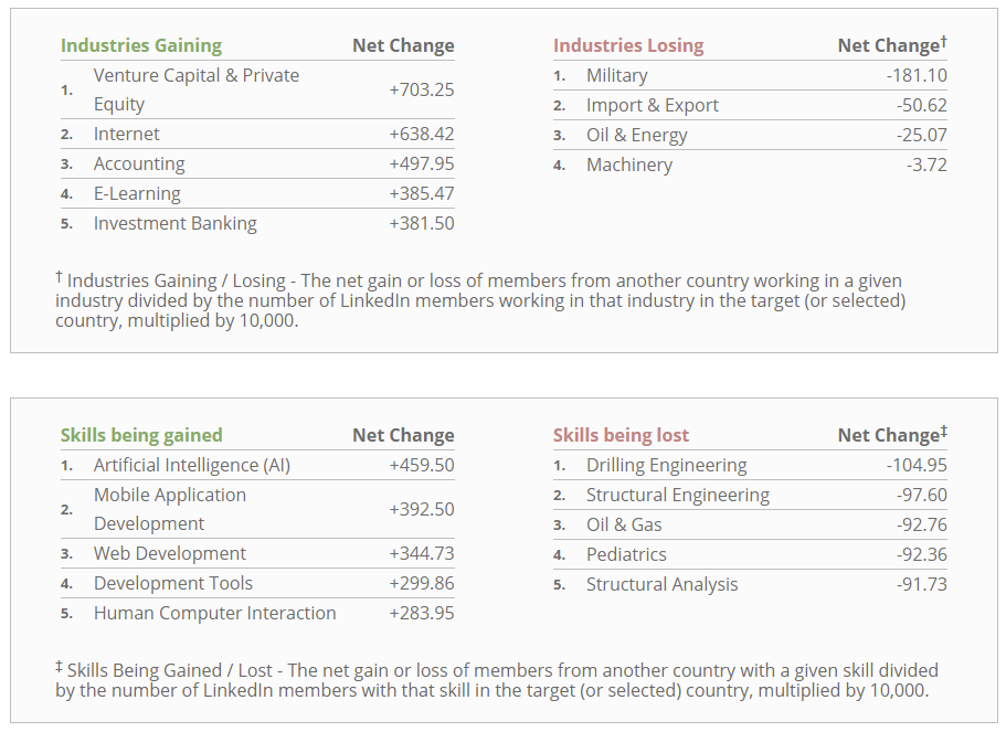
A sample of the visualisation with Singapore as the selected country can be seen in the screenshot before.
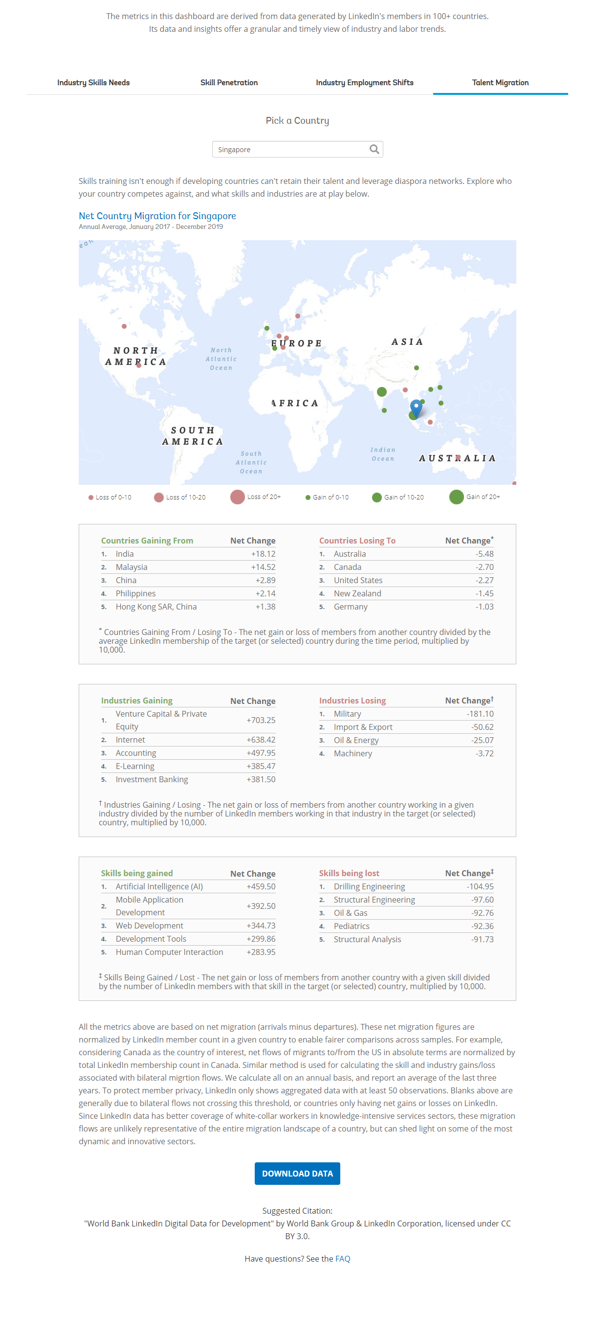
As can be seen in the visualisation below, it provides a simple map showing the migration of talent to and from the selected country from and to the top 10 countries. The countries which the selected countries are losing to are represented by a red circle on the map, while those the selected countries are gaining from are represented by a green circle on the map. The size of the circle represents the net migration per 10k LinkedIn members of the selected country.
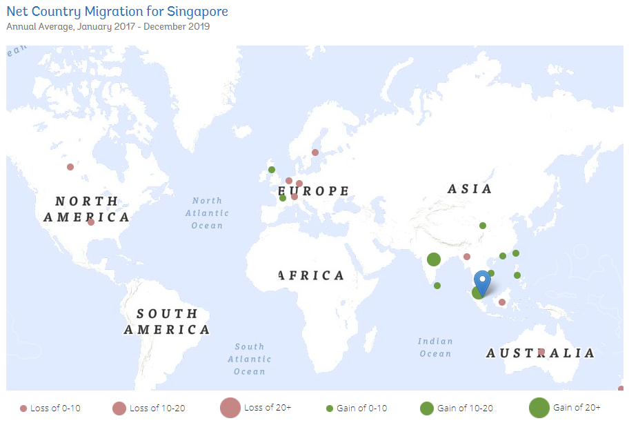
Hovering over a circle on the map shows a tooltip of the migration. This tooltip display the country, net migration value and the rank of the country.
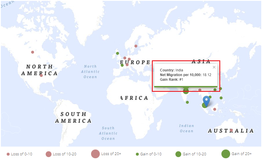
Following the map, there is a table which shows the top 5 countries the selected country is gaining or losing to:
Finally, there are 2 tables which shows up to the top 5 industries and skills the selected country is gaining or losing:
2.2 Possible improvements for the official visualisation
The following are the proposed improvements over the official visualisation:
The visualisation lacks interactivity to allow the user to perform deeper analyses. There is only a selection of country and the information is presented in the default way with no other option. The interactivity could be improved by allowing the user to select more options besides the country. For example, we could allow the user to select the date range, or let them filter by skill category or industry sections that they want to focus on. We could also allow the user to filter by region or other fields.
The visualisation only shows the top 10 countries on the map, and top 5 countries, industries and skills in the table. A user may want to know more than just the top N for these metrics.
The visualisation of the map and table makes it difficult to visualise the inflow vs outflow of the selected country. A visualisation which allows for comparison between inflow and outflow could be useful to know if a country is gaining or losing talent.
2.3 Proposed Visualisations
To visualise migration, we propose the following types of visualisations:
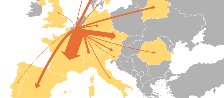
Flow Map - A flow map shows the world map and the “flow” of migration to and from the source country. It has lines between a source and destination location. The direction of the flow can either be indicated using arrows or colours. The width of the lines can be adjusted to indicate the value of the flow. An alternative to the flow map could be the choropleth map (detailed below), or a combination of both.
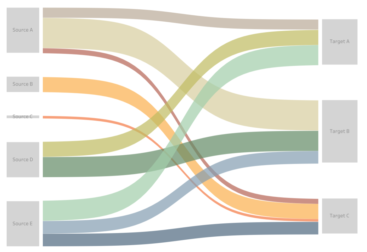
Sankey Diagram - A sankey diagram is a network diagram that represents flow between nodes. The value of the flows between nodes is usually determined by the width of the lines connecting them. As a general rule of thumb, the source node is usually on the left and the destination node is on the right. An advantage of using the sankey diagram would be that you can easily visualise the inflow and outflow of a node.
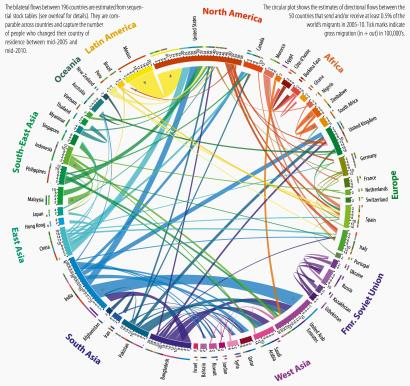
Chord Diagram - A chord diagram shows the flows between source and destination nodes. It is aesthetically pleasing and if well presented can provide useful information on the values as well as direction of the flow. However, one downside is that it could be too cluttered if there are too many nodes represented on the diagram, leading to too many connecting lines.
Choropleth Map - A choropleth map shows different regions shaded by various statistical properties. The lighter areas usually represent smaller values and the darker areas represent larger values. An advantage of the choropleth map is that it provides the viewer with an overview of the values at a quick glance, including providing them with geospatial context, something that may be lacking with the Sankey Diagram or Chord Diagram.
In terms of interactivity, we will allow the user to specify the following:
The selected country they would like to visualise
The year they would like to visualise
The type of migration they would like to visualise i.e. country, industry or skill
If they would like to filter by certain fields such as region, industry or skill category
3. Visualisation Prototypes
In this section, we detail how prototypes of the proposed visualisations were prepared.
3.1 Install and load packages
First, we install the packages that are required for our visualisations using the following code snippet. The code snippet will iteratively install (if required) and load packages from a list. The following are the packages that will be used for our visualisations:
tidyverse - The tidyverse catalogue of packages will be used as our base for data cleaning, wrangling and manipulation
readxl - The readxl package is used for us to read the excel files which contain our data
maps, geosphere, sf, leaflet - These packages are used for geospatial manipulation and map visualisations
networkD3 - The networkD3 package will be used to visualise various network diagrams, in particular the Sankey diagram
chorddiag - The chorddiag package will be used to explore chord diagrams
randomcoloR - The randomcoloR package is used to generate colour palettes of arbitrary lengths
# list of packages we want to install and/or load
packages = c('tidyverse', 'readxl', 'maps', 'geosphere', 'sf', 'leaflet', 'rworldmap', 'networkD3', 'chorddiag', 'randomcoloR')
# loop through the packages
for (p in packages){
  # try to load the package using require
  if(!require(p, character.only = TRUE)) {
    # install the package if require fails
    install.packages(p)
    library(p, character.only = TRUE)
  }
}
3.2 Load the files provided by the Linkedin-Worldbank dataset
We use the following code snippet to load the excel files, specifying the file and sheet that we want to read. The read_excel function comes from the readxl package.
industryEmploymentGrowth <- read_excel("../data/public_use-industry-employment-growth.xlsx", sheet="Growth from Industry Transition")
industrySkillsNeeds <- read_excel("../data/public_use-industry-skills-needs.xlsx", sheet="Industry Skills Needs")
skillPenetration <- read_excel("../data/public_use-skill-penetration.xlsx", sheet="Skill Penetration")
countryMigration <- read_excel("../data/public_use-talent-migration.xlsx", sheet="Country Migration")
industryMigration <- read_excel("../data/public_use-talent-migration.xlsx", sheet="Industry Migration")
skillMigration <- read_excel("../data/public_use-talent-migration.xlsx", sheet="Skill Migration")
3.3 Exploring the migration datasets
First, we take a look at the 3 migration datasets using the following code snippets. We use the glimpse function to preview the countryMigration dataset. From the results, we can see that the data contains both the base country and the target country along with other information like the code, region, income and lat/long. For every base-target pair, there are migration values of net_per_10K for the years 2015 to 2019.
glimpse(countryMigration)
Rows: 4,148
Columns: 17
$ base_country_code        <chr> "ae", "ae", "ae", "ae", "ae", "ae",~
$ base_country_name        <chr> "United Arab Emirates", "United Ara~
$ base_lat                 <dbl> 23.42408, 23.42408, 23.42408, 23.42~
$ base_long                <dbl> 53.84782, 53.84782, 53.84782, 53.84~
$ base_country_wb_income   <chr> "High Income", "High Income", "High~
$ base_country_wb_region   <chr> "Middle East & North Africa", "Midd~
$ target_country_code      <chr> "af", "dz", "ao", "ar", "am", "au",~
$ target_country_name      <chr> "Afghanistan", "Algeria", "Angola",~
$ target_lat               <dbl> 33.939110, 28.033886, -11.202692, -~
$ target_long              <dbl> 67.709953, 1.659626, 17.873887, -63~
$ target_country_wb_income <chr> "Low Income", "Upper Middle Income"~
$ target_country_wb_region <chr> "South Asia", "Middle East & North ~
$ net_per_10K_2015         <dbl> 0.19, 0.19, -0.01, 0.16, 0.10, -1.0~
$ net_per_10K_2016         <dbl> 0.16, 0.25, 0.04, 0.18, 0.05, -3.31~
$ net_per_10K_2017         <dbl> 0.11, 0.57, 0.11, 0.04, 0.03, -4.01~
$ net_per_10K_2018         <dbl> -0.05, 0.55, -0.02, 0.01, -0.01, -4~
$ net_per_10K_2019         <dbl> -0.02, 0.78, -0.06, 0.23, 0.02, -4.~
Looking at the industryMigration dataset, it contains the country and industry names and the migration values for such.
glimpse(industryMigration)
Rows: 5,295
Columns: 13
$ country_code       <chr> "ae", "ae", "ae", "ae", "ae", "ae", "ae",~
$ country_name       <chr> "United Arab Emirates", "United Arab Emir~
$ wb_income          <chr> "High income", "High income", "High incom~
$ wb_region          <chr> "Middle East & North Africa", "Middle Eas~
$ isic_section_index <chr> "C", "J", "J", "J", "J", "J", "M", "M", "~
$ isic_section_name  <chr> "Manufacturing", "Information and communi~
$ industry_id        <dbl> 1, 3, 4, 5, 6, 8, 9, 10, 11, 12, 13, 14, ~
$ industry_name      <chr> "Defense & Space", "Computer Hardware", "~
$ net_per_10K_2015   <dbl> 378.74, 100.97, 1079.36, 401.46, 1840.33,~
$ net_per_10K_2016   <dbl> 127.94, 358.14, 848.15, 447.39, 1368.42, ~
$ net_per_10K_2017   <dbl> 8.20, 112.98, 596.48, 163.99, 877.71, 365~
$ net_per_10K_2018   <dbl> 68.51, 149.57, 409.18, 236.69, 852.39, 28~
$ net_per_10K_2019   <dbl> 49.55, 182.22, 407.41, 188.07, 519.40, 28~
The skillMigration dataset is similar to the industry migration but contains the migration information of the country for the skills.
glimpse(skillMigration)
Rows: 17,617
Columns: 12
$ country_code         <chr> "af", "af", "af", "af", "af", "af", "af~
$ country_name         <chr> "Afghanistan", "Afghanistan", "Afghanis~
$ wb_income            <chr> "Low income", "Low income", "Low income~
$ wb_region            <chr> "South Asia", "South Asia", "South Asia~
$ skill_group_id       <dbl> 2549, 2608, 3806, 50321, 1606, 3139, 13~
$ skill_group_category <chr> "Tech Skills", "Business Skills", "Spec~
$ skill_group_name     <chr> "Information Management", "Operational ~
$ net_per_10K_2015     <dbl> -791.59, -1610.25, -1731.45, -957.50, -~
$ net_per_10K_2016     <dbl> -705.88, -933.55, -769.68, -828.54, -84~
$ net_per_10K_2017     <dbl> -550.04, -776.06, -756.59, -964.73, -84~
$ net_per_10K_2018     <dbl> -680.92, -532.22, -600.44, -406.50, -58~
$ net_per_10K_2019     <dbl> -1208.79, -790.09, -767.64, -739.51, -7~
3.4 Tidying the data files into the tidy data format
From the above, we can see that the migration values for the different years are stored in individual columns. In order to aid our analysis, it is proposed to tidy the datasets into a tidy data format. The tidy data format stipulates the following:
Every column is a variable.
Every row is an observation.
Every cell is a single value.
The datasets above violates the part where the column headers stores a value rather than a variable. It would be better to create a new column called year to store the year values rather than having it span across 5 columns. We can achieve this by using the pivot_longer function as follows.
countryMigrationPivot <- countryMigration %>%
  pivot_longer(col = starts_with("net_per_10K_"),
               names_to = "year",
               names_prefix = "net_per_10K_",
               values_to = "net_per_10K")

industryMigrationPivot <- industryMigration %>%
  pivot_longer(col = starts_with("net_per_10K_"),
               names_to = "year",
               names_prefix = "net_per_10K_",
               values_to = "net_per_10K")

skillMigrationPivot <- skillMigration %>%
  pivot_longer(col = starts_with("net_per_10K_"),
               names_to = "year",
               names_prefix = "net_per_10K_",
               values_to = "net_per_10K")
We glimpse the countryMigrationPivot dataset to see that the data from the net_per_10K columns for individual years has been pivoted to form a “year” column and “net_per_10K” column.
glimpse(countryMigrationPivot)
Rows: 20,740
Columns: 14
$ base_country_code        <chr> "ae", "ae", "ae", "ae", "ae", "ae",~
$ base_country_name        <chr> "United Arab Emirates", "United Ara~
$ base_lat                 <dbl> 23.42408, 23.42408, 23.42408, 23.42~
$ base_long                <dbl> 53.84782, 53.84782, 53.84782, 53.84~
$ base_country_wb_income   <chr> "High Income", "High Income", "High~
$ base_country_wb_region   <chr> "Middle East & North Africa", "Midd~
$ target_country_code      <chr> "af", "af", "af", "af", "af", "dz",~
$ target_country_name      <chr> "Afghanistan", "Afghanistan", "Afgh~
$ target_lat               <dbl> 33.93911, 33.93911, 33.93911, 33.93~
$ target_long              <dbl> 67.709953, 67.709953, 67.709953, 67~
$ target_country_wb_income <chr> "Low Income", "Low Income", "Low In~
$ target_country_wb_region <chr> "South Asia", "South Asia", "South ~
$ year                     <chr> "2015", "2016", "2017", "2018", "20~
$ net_per_10K              <dbl> 0.19, 0.16, 0.11, -0.05, -0.02, 0.1~
3.5 Migration flow map using maps and geosphere packages
Next, we try to come up with a migration flow map using maps and geosphere package. The maps package is used to plot the map and geosphere package is used to calculate the great circle lines on the maps. We first filter the data using Singapore and 2019 to experiment. For every target country, we calculate the great circle plot the lines on the map. The width of the line is based on the ratio of the country’s migration to the maximum absolute value of the migration and the colour of the line is either green or red depending on whether the net migration was positive or negative.
# We set the variables we want to try out
# In this case, we filter by Singapore and 2019
filterCountry <- "Singapore"
filterYear <- 2019

# We filter the migration data using the variables above
flowMapDf <- countryMigrationPivot %>%
  filter(base_country_name == filterCountry, year == filterYear)

# We get the max migration value
maxMigration <- max(abs(flowMapDf$net_per_10K))

# We create a base map
map("world", col="#999999", fill=TRUE, bg="#dddddd")

# We loop through each row of the migration dataset
for (j in 1:nrow(flowMapDf)) {
  # we get the base and target lat/long
  baseLat <- flowMapDf[j,]$base_lat
  baseLon <- flowMapDf[j,]$base_long
  targetLat <- flowMapDf[j,]$target_lat
  targetLon <- flowMapDf[j,]$target_long
  # we compute a great circle line from the base to the target using gcIntermediate
  migration <- gcIntermediate(c(baseLon, baseLat), c(targetLon, targetLat), n=100, addStartEnd=TRUE)
  colour = ifelse(flowMapDf[j,]$net_per_10K >= 0, "green", "red")
  # we draw the line on the map
  lines(migration, col=colour, lwd=abs(flowMapDf[j,]$net_per_10K)/maxMigration*10)
}
From the results, we can see that the lines are plotted on the map as we wanted. However, there were a few problems with this visualisation. It was difficult to make out where the target countries were. There were also many overlapping lines. The width was also difficult to make out. Further, any lines which wrapped around the dateline resulted in horizontal lines across the width of the map.
These could be improved by having interactivity on the map to allow for more information to be shown through tooltips or by zooming in. We next explore another way to draw the migration flow on the map.
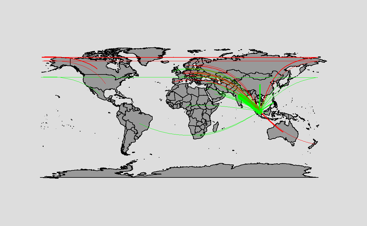
3.6 Migration flow map using leaflet and sf packages
In order to overcome some of the issues we faced in our previous visualisation using older packages, we attempted to use sf and leaflet to create our migration map. We use lines to draw the migration to bring the user from the selected country to the target country. Green lines refer to positive net migration while red lines refer to negative net migration. A circular marker is also added to the destination country for users to see where the destination countries are. Tooltips are added to both the lines and the markers to show the user the country and the migration values. The usage of leaflet allows interactivity through tooltips and viewport movement of the map.
# We set the variables we want to try out
# In this case, we filter by Singapore and 2019
filterCountry <- "Singapore"
filterYear <- 2019

# We filter the migration data using the variables above
flowMapSf <- countryMigrationPivot %>%
  filter(base_country_name == filterCountry, year == filterYear)

flowMapSfg <- vector(mode = "list", length = nrow(flowMapSf))

for (j in 1:nrow(flowMapSf)) {
  flowMapSfg[[j]] <- st_linestring(rbind(c(flowMapSf[j,]$base_long,flowMapSf[j,]$base_lat),c(flowMapSf[j,]$target_long,flowMapSf[j,]$target_lat)))
}

maxMigration = max(abs(flowMapSf$net_per_10K))

flowMapSf <- flowMapSfg %>%
  st_sfc(crs = 4326) %>%
  st_sf(geometry = .) %>%
  cbind(flowMapSf) %>%
  mutate(colour = ifelse(net_per_10K > 0, "green", "red"), value=log(abs(net_per_10K))*5) %>%
  mutate(label = lapply(paste0("Country: ",target_country_name,"<br/>Net migration: ",net_per_10K), htmltools::HTML)) %>%
  filter(value != 0)

flowMapSf %>%
  st_segmentize(units::set_units(100, km)) %>%
  mutate(geometry = (geometry + c(180,90)) %% c(360) - c(180,90)) %>%
  st_wrap_dateline(options = c("WRAPDATELINE=YES",  "DATELINEOFFSET=180"), quiet = TRUE) %>%
  leaflet() %>%
  addTiles() %>%
  addCircleMarkers(
    lng = ~target_long,
    lat = ~target_lat,
    label = ~label,
    color = ~colour,
    radius = ~value,
    stroke = FALSE,
    fillOpacity = 0.5
  ) %>%
  addPolylines(label = ~label,
               color = ~colour,
               weight = ~value)
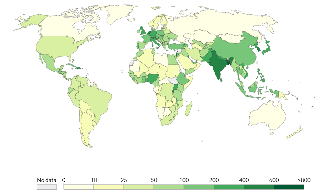
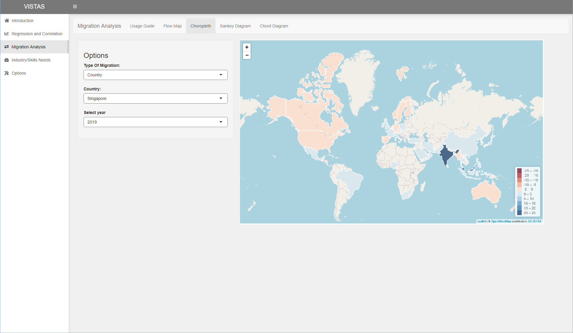
3.7 Choropleth map using leaflet and rworldmap packages
An alternative to migration flow maps could be choropleth maps, which highlight areas according to their values. The migration flow map may be too confusing if there are too many lines overlapping each other, even if the user is able to zoom. In this visualisation, we explore choropleth maps using leaflet and rworldmap.
# We set the variables we want to try out
# In this case, we filter by Singapore and 2019
filterCountry <- "Singapore"
filterYear <- 2019

# We create the choropleth data using the variables above
migrationChoropleth <- countryMigrationPivot %>%
  filter(base_country_name == filterCountry, year == filterYear) %>%
  select(target_country_name, net_per_10K) %>%
  mutate(label = lapply(paste0("Country: ",target_country_name,"<br/>Net migration: ",net_per_10K), htmltools::HTML))

# We use joinCountryData2Map to join the data with the spatial data
migrationChoroplethMap <- joinCountryData2Map(migrationChoropleth, joinCode = "NAME", nameJoinColumn = "target_country_name") %>%
  spatialEco::sp.na.omit(col.name = "net_per_10K")
49 codes from your data successfully matched countries in the map
1 codes from your data failed to match with a country code in the map
194 codes from the map weren't represented in your data
# We compute the max migration, rounding up to the nearest 5
maxMigration = plyr::round_any(max(abs(migrationChoropleth$net_per_10K)),5, f=ceiling)
# We create the bins and a diverging palette
bins <- seq(-maxMigration, maxMigration, 5)
pal <- colorBin("RdBu", bins = bins)
# We plot the migration choropleth map
migrationChoroplethMap %>%
leaflet() %>%
addTiles() %>%
addPolygons(fillColor = ~pal(net_per_10K),
label = ~label,
weight = 2,
opacity = 1,
color = "white",
dashArray = "3",
fillOpacity = 0.7) %>%
addLegend(pal = pal, values = ~net_per_10K, opacity = 0.7, title = NULL,
position = "bottomright")
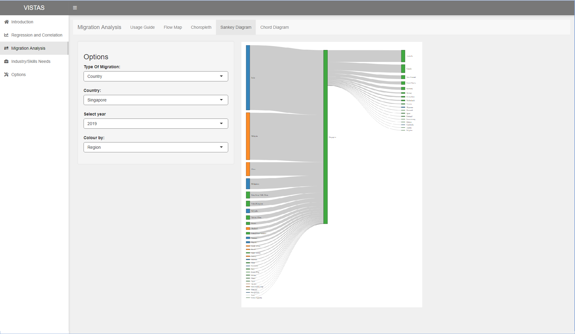
3.8 Sankey diagram using networkD3
Next, we try to plot the sankey diagram around the selected couuntry. We position the selected country in the middle with countries with positive net migration on the left and countries with negative net migration on the right to represent movement from left to right. The sankey diagram is useful to compare the inflow and outflow values by comparing the left and right. It also lets the user have an appreciation of the top countries as it is sorted by the values. From the visualisation below, we can see that Singapore imports more than exports talent, and the top country we import and export from and to are India and Australia respectively.
# We set the variables we want to try out
# In this case, we filter by Singapore and 2019
filterCountry <- "Singapore"
filterYear <- 2019

# Further, we set whether we want to colour the countries by their region or income groups
colourGroups <- c("region","income_group")
# Set parameter to colour group by - "region" (1) or "income_group" (2)
chosenGroup <- 2

# We get a distinct country dataframe with their corresponding income group and region
countryDf <- countryMigrationPivot %>%
  distinct(base_country_name, base_country_wb_income, base_country_wb_region) %>%
  rename(country = base_country_name, income_group = base_country_wb_income, region = base_country_wb_region)

# We get the migration df we want to plot the sankey diagram
migrationDf <- countryMigrationPivot %>%
  filter(base_country_name == filterCountry, year == filterYear, net_per_10K != 0) %>%
  select(base_country_name, target_country_name, net_per_10K)

# We swap the dataframe depending on whether the net migration is positive or negative
migrationSwapDf <- as.data.frame(migrationDf %>%
  mutate(source = ifelse(net_per_10K >= 0, target_country_name, base_country_name)) %>%
  mutate(target = ifelse(net_per_10K >= 0, base_country_name, target_country_name)) %>%
  mutate(value = abs(net_per_10K)*10000) %>%
  select(source, target, value))

# We get the absolute values for all countries. This will be used to sort the countries
valuesDf <- migrationDf %>%
  mutate(country = target_country_name) %>%
  mutate(value = abs(net_per_10K)) %>%
  select(country, value)

# We create the nodes
nodes <- data.frame(
  name=c(as.character(migrationSwapDf$source),
  as.character(migrationSwapDf$target)) %>% unique()
) %>%
  left_join(countryDf, by=c("name"="country")) %>%
  left_join(valuesDf, by=c("name"="country")) %>%
  replace_na(list(value = 0)) %>%
  arrange(desc(value))

# We set their IDs
migrationSwapDf$IDsource <- match(migrationSwapDf$source, nodes$name)-1
migrationSwapDf$IDtarget <- match(migrationSwapDf$target, nodes$name)-1

# We set the colour scale
my_color <- 'd3.scaleOrdinal(d3.schemeCategory10)'

# We create the sankey plot
p <- sankeyNetwork(Links = migrationSwapDf, Nodes = nodes,
              Source = "IDsource", Target = "IDtarget",
              Value = "value", NodeID = "name",
              colourScale = my_color, NodeGroup = colourGroups[chosenGroup],
              sinksRight=FALSE,
              height = 1000, width = 1000)
p
3.9 Chord diagram by country using chorddiag
Next, we attempt to draw a chord diagram using the chorddiag package. We were able to plot the chord diagram. We plotted two diagrams - one from the perspective of positive net migration (import) and one from the perspective of negative net migration (export).
However, there were some limitations due to the dataset we had as migration was represented using net migration only; we did not have separate values for import and export. Further, the net migration value represented the net_per_10K based on the base countries’ number of LinkedIn members. Therefore, the absolute migration values were not comparable across the countries.
Also, having too many countries made the visualisation cluttered and difficult differentiate.
We explored other ways to make the visualisation less cluttered in the next few sections
# We set the variables we want to try out
# In this case, we filter by the year 2019
filterYear <- 2019

# In order to use the chorddiag package, we create a matrix of the countries
chordDf <- countryMigrationPivot %>%
  filter(year == filterYear) %>%
  select(base_country_name, target_country_name, net_per_10K) %>%
  pivot_wider(names_from=target_country_name, values_from = net_per_10K, values_fill = 0, names_sort=TRUE) %>%
  arrange(base_country_name) %>%
  column_to_rownames("base_country_name")

countryNames <- row.names(chordDf)

# We create separate dataframes with positive and negative values
chordPosDf <- chordDf
chordPosDf[chordPosDf<0] <- 0.0
chordNegDf <- chordDf
chordNegDf[chordNegDf>=0] <- 0.0
chordNegDf <- abs(chordNegDf)

# We convert the dataframes into matrices to be used with the chorddiag function
chordPosMatrix <- as.matrix(chordPosDf)
chordNegMatrix <- as.matrix(chordNegDf)

# We create a palette
colours <- distinctColorPalette(length(countryNames))

# We plot the chord diagram
p <- chorddiag(chordPosMatrix, height=1000, width=1000, groupnamePadding = 20, showTicks = FALSE, groupThickness = 0.01, groupColors = colours, precision=3, showZeroTooltips = FALSE)
p
p <- chorddiag(chordNegMatrix, height=1000, width=1000, groupnamePadding = 20, showTicks = FALSE, groupThickness = 0.01, groupColors = colours, precision=3, showZeroTooltips = FALSE)
p
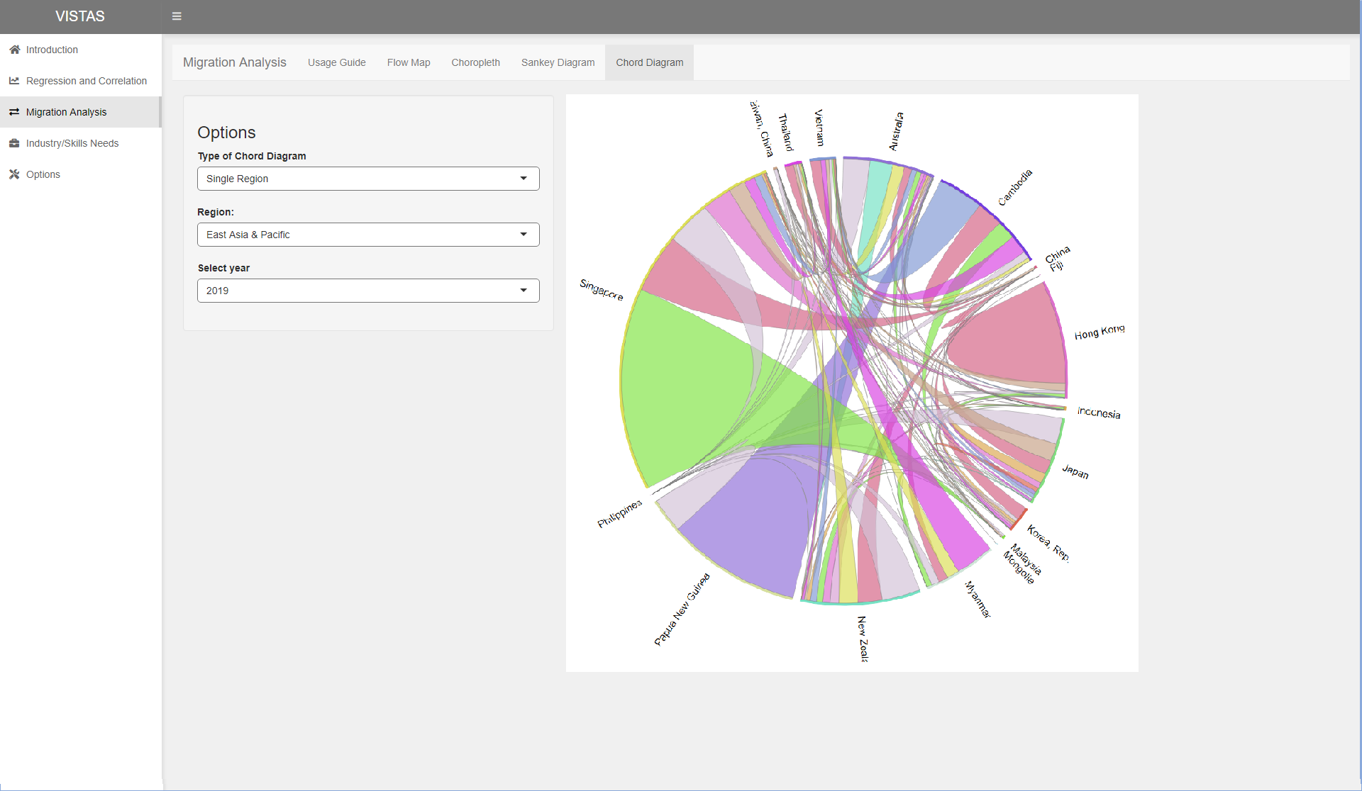
3.10 Chord diagram by country by region using chorddiag
In order to reduce the clutteredness, we try drawing the chord diagrams but only for a certain region. This visualisation was less cluttered, but we were only able to visualise intra-region migration.
# We set the variables we want to try out
# In this case, we filter by the year 2019
filterYear <- 2019
filterRegion <- "East Asia & Pacific"

# In order to use the chorddiag package, we create a matrix of the countries
chordDf <- countryMigrationPivot %>%
  filter(year == filterYear,
         base_country_wb_region == filterRegion,
         target_country_wb_region == filterRegion) %>%
  select(base_country_name, target_country_name, net_per_10K) %>%
  pivot_wider(names_from=target_country_name, values_from = net_per_10K, values_fill = 0, names_sort=TRUE) %>%
  arrange(base_country_name) %>%
  column_to_rownames("base_country_name")

countryNames <- row.names(chordDf)

# We create separate dataframes with positive and negative values
chordPosDf <- chordDf
chordPosDf[chordPosDf<0] <- 0.0
chordNegDf <- chordDf
chordNegDf[chordNegDf>=0] <- 0.0
chordNegDf <- abs(chordNegDf)

# We convert the dataframes into matrices to be used with the chorddiag function
chordPosMatrix <- as.matrix(chordPosDf)
chordNegMatrix <- as.matrix(chordNegDf)

# We create a palette
colours <- distinctColorPalette(length(countryNames))

# We plot the chord diagram
p <- chorddiag(chordPosMatrix, height=1000, width=1000, groupnamePadding = 20, showTicks = FALSE, groupThickness = 0.01, groupColors = colours, precision=3, showZeroTooltips = FALSE)
p
p <- chorddiag(chordNegMatrix, height=1000, width=1000, groupnamePadding = 20, showTicks = FALSE, groupThickness = 0.01, groupColors = colours, precision=3, showZeroTooltips = FALSE)
p
3.11 Chord diagram by region using chorddiag
Next, we tried to group the data by regions in order to reduce the clutteredness. The chord diagram grouped the countries by their region. Since the net migration values were represented as proportions, we took the means of these values instead of the sum when grouping.
chordDfPos2 <- countryMigrationPivot %>%
  filter(year == 2019, net_per_10K >= 0) %>%
  group_by(base_country_wb_region, target_country_wb_region) %>%
  summarise(avg=mean(net_per_10K)) %>%
  pivot_wider(names_from=target_country_wb_region,values_from = avg, values_fill = 0.0, names_sort = TRUE) %>%
  arrange(base_country_wb_region) %>%
  column_to_rownames("base_country_wb_region")

chordMatPos2 <- as.matrix(chordDfPos2)

chorddiag(chordMatPos2)
chordDfNeg2 <- countryMigrationPivot %>%
  filter(year == 2019, net_per_10K < 0) %>%
  group_by(base_country_wb_region, target_country_wb_region) %>%
  summarise(avg=mean(net_per_10K)) %>%
  pivot_wider(names_from=target_country_wb_region,values_from = avg, values_fill = 0.0, names_sort = TRUE) %>%
  arrange(base_country_wb_region) %>%
  column_to_rownames("base_country_wb_region") %>%
  abs()

chordMatNeg2 <- as.matrix(chordDfNeg2)

chorddiag(chordMatNeg2)
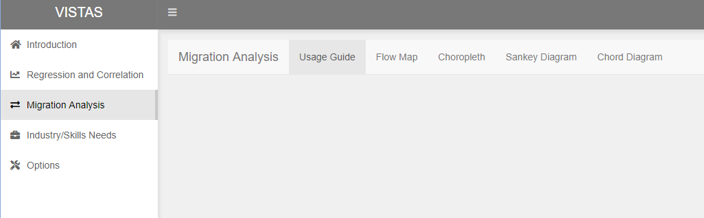
4 Dashboard Prototyping
This assignment will eventually be used and combined with works of the other project group members into a shiny dashboard for analysis.
The proposed prototype for the dashboard is as follows, with elaboration on the part on migration analysis.
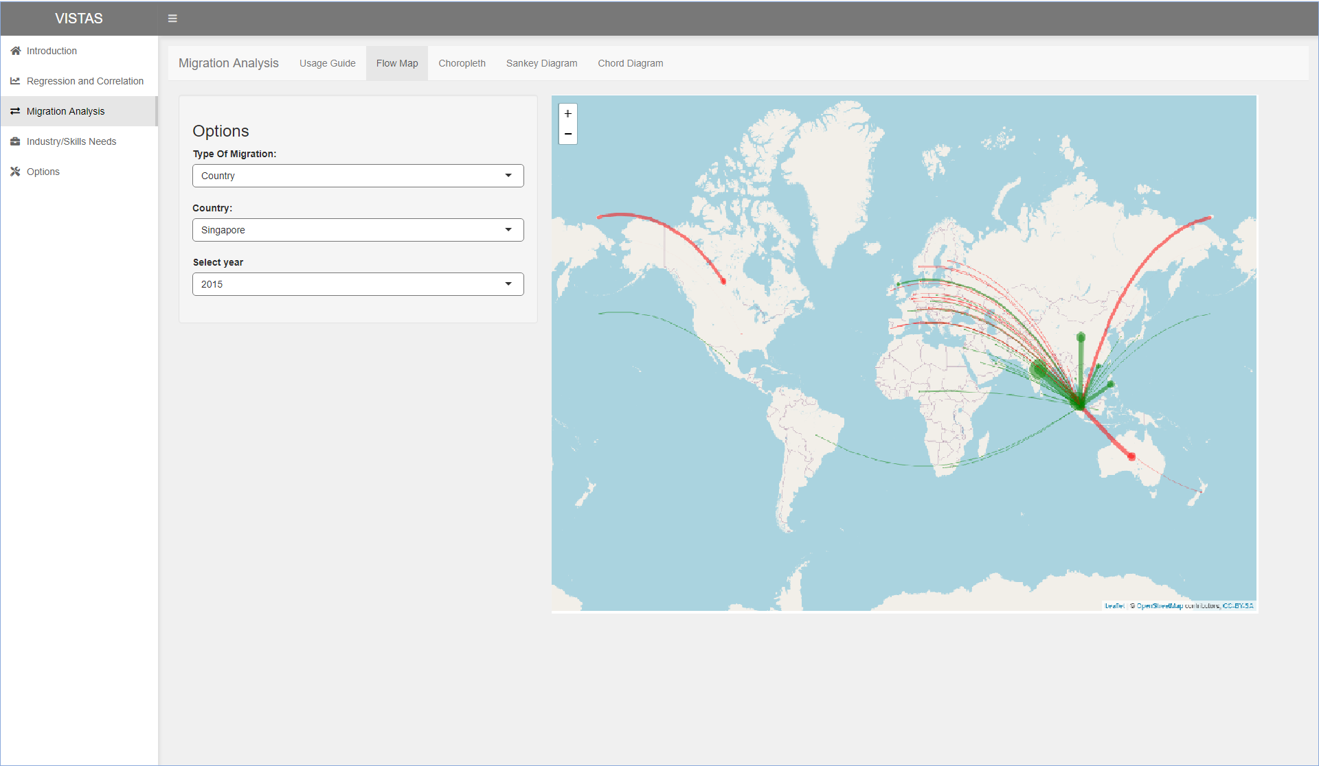
It is proposed to use the shiny dashboard layout for the dashboard. There will be items on the sidebar to select for the different analyses. On clicking on migration analysis, it will bring the user to the usage guide.
Next, the user will be able to click on the various tabs on the top to show the flow map, choropleth map, sankey diagram and chord diagram. The proposed layout for the various tabs are shown in the following images. Options will be on the left and the visualisation will be shown on the right.
5 Conclusion
The proposed visualisations will allow users to visualise migration trends by Country, Industry and Skills. The migration flow map, choropleth map and sankey diagram allow the viewer to visualise which are the top countries, industries and skills a selected country is gaining from, while the chord diagram allows the viewer to visualise the movement individual regions or the whole world aggregated at regions.
Based on the preliminary visualisations we have gotten for Singapore, we can see that Singapore imports more talent than exports them. Singapore imports most from India and exports most to Australia. However, this slightly differs from the following Straits Times report at https://www.straitstimes.com/singapore/migrants-in-spore-mostly-from-malaysia which shows that Malaysia has the biggest share of migrants in Singapore. The source of data for the Straits Times report is https://www.un.org/en/development/desa/population/migration/data/estimates2/estimates19.asp. This difference could be attributed to how LinkedIn data is not representative of the total workforce, but has better coverage of white-collar workers in knowledge-intensive sectors.